Improving secondhand bike buying and selling experience

Team Members: Danrui Sun, Lois Zhao, Gaby

Jump to
Overview
A snapshot of the problem, solution, and impact
Problem
The problem, why is it important, and how we identified it
Solution
Insights to concepts, Wireframes, and High Fidelity Design
Effectiveness
How we measured if our solution actually works
Reflection
What I could have done better and what have I learned

01

Problem

Users are unable to purchase secondhand bikes as effortlessly as a new bike

Why does this problem occur?

Lack of Information

Bike buyers don’t have enough information to make an informed purchase decision quickly

Safety Concerns

Bike Buyers don’t feel comfortable visiting the Seller’s house to collect the bike due to fear of personal safety

Time-taking process

Information sharing constraints, negotiations, examinations, etc. increase makes buying or selling a time taking process

02

Solution

The solution was to create a 3-party marketplace - buyer, seller and an expert. The experts are people who earn a commission on the sale of the product. The expert helps complete the listing with a lot of details that would help the buyer decide more easily. To ensure the expert is honest, buyers are asked to review the expert too when picking up the bike.

Product listing
Home page shows 5 of the key details about the bike that the user would need to make a quick purchase - image of the bike, product name, price, distance and quality (denoted by our expert rating here)

Close up shots
Close up shots of the bike along with video walkthroughs that the expert took. This makes it easier for the buyer to get a sense of the condition of the bike.

What is working and what isn’t
These are labels that helps the user easily what is wrong and good about the bike. Clicking on the ‘what is not working’ label pops open an image of the damaged part of the bike

Bike fit
Home Users can use the size calculator to see if the bike is a fit. This detail need only be input once. Upon input, the a figure of the input size is shown to scale next to the bike.
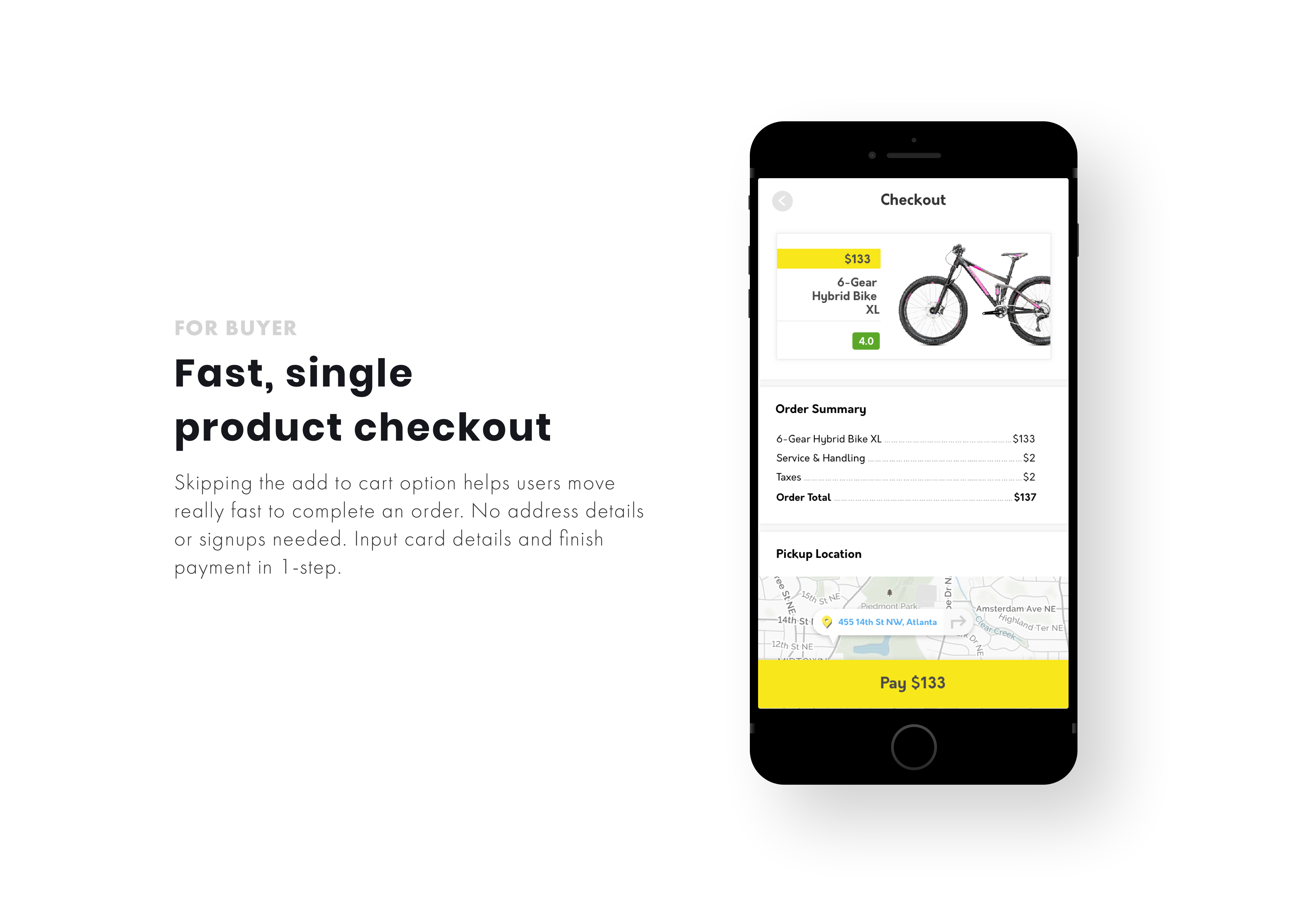
Shopping cart
To make the buying process faster, we removed the concept of adding something to a shopping cart. We found that at any time, our users won't be buying more than 1 bike.
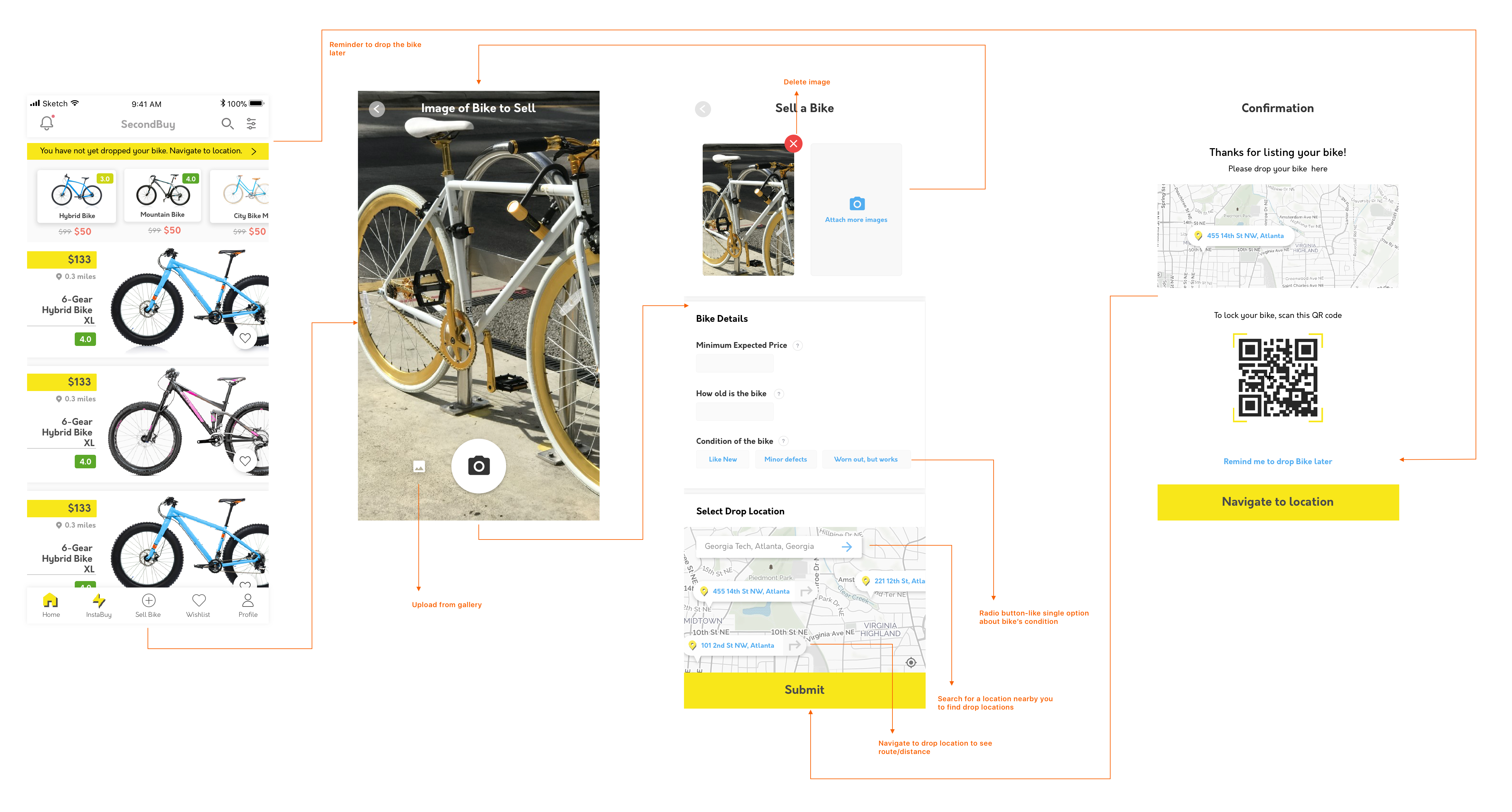
Selling details
The seller has to enter minimal information while setting up the bike for sale. This would encourage more people to sell. The rest of the details are added to the listing by the expert.

03

Process

Why is this problem worth solving?

From a competitive analysis

Large Ignored market
Despite being a large opportunity globally, secondhand market hasn’t seen great products that solve key issues. Commonly used products like Craigslist, Facebook Marketplace and other niche ones give subpar user experience

A look at Existing Products
Comparing experiences for shoppers on Amazon and Facebook Marketplace shows how information deficit FB Marketplace or craigslist is in comparison to that Amazon gives for a new bike buyer.

How did we identify key pain points?

Some of the user research methods conducted

01. Unstructured Interviews
12 Participants

Goal
Get qualitative data about current User Experience. This was useful since we had little background knowledge in the area

Outcome
Started noticing patterns - similarities in purchasing process, what people looked for, expectations, etcDifferent people shopped different products differentlyDecided to focus on Georgia Tech students, who’re looking for secondhand bikes


02. Survey
82 Participants

Goal
Gather quantitative data to see if patterns were consistentIdentify major pain points

Outcome
Led to several primary and secondary insights (scroll through to see insights)

03. Contextual Inquiry
8 Participants

Goal
Gather insights into purchasing process, thoughts and emotions - Non-verbal cues that go into decision-making

Outcome
Led to several secondary insights in user needs - why users personally examine bikes, what observations do users make, pricing constraints, etc

What were some of our key insights?

These insights were the basis of our design concepts

Lack of Information

Bike buyers don’t have enough information to make an informed purchase decision quickly

Safety Concerns

Bike Buyers don’t feel comfortable visiting the Seller’s house to collect the bike due to fear of personal safety

Time-taking process

Information sharing constraints, negotiations, examinations, etc. increase makes buying or selling a time taking process

See some secondary insights

Need to know what is working, but importantly what is not ~expect damages
Want to see if the bike fits the user’s physique
Reviews, ratings of bike helps users know if to trust the built quality
Share the listing with parents to buy, cos students no money
Accurate location important - can’t walk long distance to get a bike ~ unless costly
More expensive bikes bought through physical examination - risk okay on cheap ones

THOUGHT

What Information would a secondhand bike buyer need, about a bike, for an optimal buying experience?

How we synthesised our research findings

Affinity Mapping
Some of the key insights were:
Sellers
   1. cannot get access to enough potential buyers
    2. think it time-consuming to list product information online.
Buyers
    1. have trouble making a decision  when the information is insufficient.     
    2. do not trust a bike's quality simply by looking at pictures online
    3. have trouble in picking the bike up or find delivery expensive
   4. finding one that fit's their budget to be hard

Our User Personas

Going from insights to design concepts

Methods we used in our ideation process

Ideation
We shortlisted key pain points from our research and proceeded to ideate solutions for those. Each brainstorming session was 15-minute long. At the end of an idea brainstorming, we discussed our ideas, and then conducted another brainstorming session. At the end of 2 sessions, we came up with 20-25 different design concepts.

Storyboards
We then developed storyboards to help explain the concepts we ideated. Our goal from the storyboard was to try to enact if these concepts could indeed delivery a better experience at current pain points.

Process Diagram

From Design Concepts to Wireframes

Step 1: Discovering a bike

Bike Inventory

Instant Buy Screen, for purchasing cheap bikes quickly

Step 2: Learning More about the bike

Bike Details

Video Close ups and walk-around

High Fidelity Design

Visual and Interaction Design

Interface Design

User Flows, tasks and Interactions

Buying a bike

Selling a bike

Interactive Prototype

Created on Framer

This was an interactive prototype that I created on Framer. It include some key interaction and motion designs too.

03

Effectiveness

How we know if our solution works?

Findings from usability testing conducted with 12 participants

01. Task Analysis and Task Rating

Test Time taken and Understandability
Complete a transaction through expert model, complete a transaction through instant buy model

Task Familiarity
Add a product to wishlist

02. Post Task System Rating, using System Usability Scale

Overall Effectiveness
Users asked 10 questions and to grade each on a scale of 1-5

Outcome
SUS score of 78.4

03. Post Task Feedback

Open-ended questions
Users asked 3 questions - What they liked most, what they thought was missing, and final comments or overall impressions of the system

Some of the key issues our design had

From the post task feedback

Issue 1
Some of the participants did not know the difference between the star rating for the expert and the product rating. Many people thought the star and product rating were the same, even though the star rating was shown under the expert.

Solution
We rectified this by having a clear demarcation for expert reviews. The reviewer information will be shown in a card format. In each card, next to the star rating, the number of buyers will be shown. Details about the expert will also shown in a card format so that users understand that the star rating is for the expert. We will also add some reviews for the expert for users to get better context.

Issue 2
Another feedback we received was that differentiating between the bike size and title was difficult. “Want the titles of the bike separated more obviously, e.g. 18'' L and Mountain bike with different Font colors or font of size. Since both are placed close to each other “.

Solution
We will change this to have the bike size shown part of the product specs below. We will also add more content to the product spec to include things like how old the bike is, since several of our user tests wanted to know.

Issue 3
We had a feature to help users compare their height with that of the bike. However, in our current design, this only shows one specific size for person, of same body size. One of our feedback was to change this to show how different body shapes would work for this bike - weight, size, etc.

Solution
We will increase the scope of our height calculator to have an option called “Advanced”. Where the user can input more details like weight, size, etc. Having all of those fields on the main screen would make it look cluttered. Hence, the "Advanced" can be used to enter multiple constraints to the height checker

Issue 4
For several users, the status message was hard to understand and was complicated. It seemed like they had to go through several steps before being able to sell the bike

Solution
We will change this to show fewer steps and a more easier and clearer process for users to follow.

04

Reflection

  • Sometimes you have to cut corners - Although we were designing to improve the app shopping and selling experience for used bikes, there was so much that is offline, and outside the app which we wanted to design for. We tried to do everything initially, only to realise some things were simply beyond scope, and to be left alone. It taught us how to better manage time.
  • Most users today have moved from landscape to portrait mode for capturing images. We stuck to a landscape mode for displaying images because that was more convenient. The issues of showing a portrait image in our current design would simply make the image look unappealing - if portrait, we would either have to blur/blacken the image background, or zoom and centre crop the image, or crop out some portions of the image losing some important details. All three options did not seem like something users would be happy with. Hence we stuck to landscape mode for images. In the later redesigns, we would look at product listing with portrait mode, and how information can be displayed over the image.
  • When we did the need analysis and compared our concepts with each other and with user requirements, each of has different ideas on which concept was more effective, and which to discard. All four of us had formed different perspectives and interpreted the concepts differently. We also couldn't justify why some of the concepts were going to be more effective than the other. We ended up having each of us score the concepts, average out our scores and select the one we all thought was most effective.
Back to top